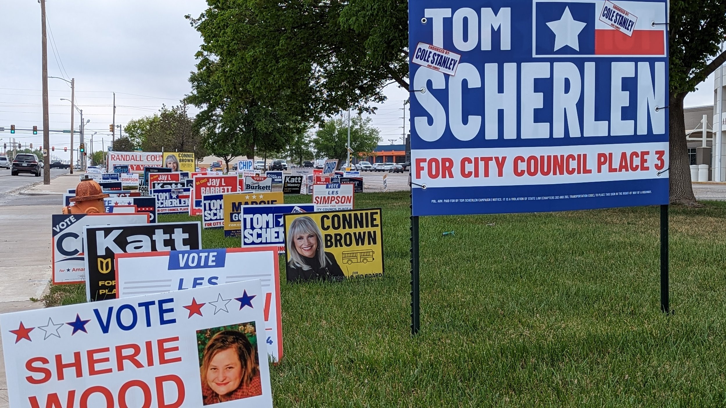
Signs at the Randall County Annex during Early Voting | Photo by Noah Dawson
Election Day has come and gone. There were winners, losers, and runoffs. For some, however, the biggest relief is that we won’t have to see as many yard signs across town. Love them or hate them, there were some signs our editorial team liked more than others. We therefore sat down and went through the very important task of ranking every local yard sign we could find from this election. In total, this included 41 signs for candidates running for Mayor of Amarillo, Amarillo City Council, Amarillo College Board, Amarillo ISD Board, Bushland ISD Board, and Canyon ISD Board.
First, though, we set some ground rules. First, we did not factor in our personal support for the candidates. In fact, some of the signs we rated highest were for candidates none of us supported, while some of the lowest ranked signs were for candidates members of our team really liked. Second, we avoided factoring in how well the candidates did in the election. In fact, most of our top 10 did not even win their elections. Third, while good logo design is important (and was one of the factors we considered), not every good logo makes a good yard sign.
At the end of the day, of course, this list is completely subjective. But, with all of that said, this was our ranking:
41: Ryan P. Brown
40: Casey Posey
39: Don Collins
38: Sherie Wood
37: John Adair
36: Kelsey Richardson
35: Josh Grisham
34: Jodi Davis
33: Jay L. Barrett
32: Michele Fortunato
31: Irene Hughes
30: Claudette Smith
29: John Ingerson
28: Katharyn Wiegand
27: Laurie Gilliland
26: Steve Trafton
25: Robin Leeah
24: Mike Yazbek
23: Nicki Junell
22: Jon Mark Beilue
21: Jared Wirt
20: Les Simpson
19: Sam Burnett
18: Steve Hill
17: Connie Brown
16: Katt Massey
15: Dean Crump
14: Margie Gonzales
13: Josh Craft
12: Dick Ford
11: Jason Foglesong
10: Tonya C. Winston

Every other candidate on our list, in some manner, played it safe. Most tended towards minimalism, which isn’t a bad choice. However, for a candidate with as much personality as Tonya C. Winston, also known as Lady Butterscotch, playing it safe would not have worked. While you might miss her name if you only glance at the sign while you’re driving down the road, it tells you everything else you need to know about her larger-than-life campaign.
9: Don Tipps

In terms of design philosophy, you can’t get much more different from Tonya C. Winston’s signs than the ones from Don Tipps. The white (and light grey) on red may be simple, but it makes for a good brand. Overall, it has few frills and is easily readable. One of the few marks against it is that, in its simplicity, it comes off as a bit generic.
8: Freda Powell

For her mayoral campaign, Freda Powell used a variation of the design she had previously used for her council campaigns. It’s highly readable from a distance, though it is hurt a bit by the fact that the design itself doesn’t take up more space on the sign.
7: Cole Stanley

Amarillo’s next mayor, Cole Stanley, might have had a built-in advantage that the logo used on his signs are based on the logo for his construction business. Still, it’s a good logo that transfers well to a sign. In fact, it’s one of the few designs we’ve seen that manages to pull off a non-blocky serif font while still being easily legible. It does have a few problems, however. The “For Mayor” text block looks out of place, while the name could be misread as “Scole Tanley.”
6: Claudia Burkett

Speaking of blocky serif fonts, this is a perfect example of using the technique right. The design is similar to others from local candidates who utilized Nobox Creative during this cycle, including Les Simpson and Josh Craft, but, in our opinion, this was the best of that bunch.
5: Jessica Garrett

When a teacher runs for school board, they often have a built-in advantage. To signal this, many include it as a slogan, such as “educator for education” or “teacher for school board.” While there is nothing wrong with those slogans, Jessica Garrett pulled it off in what we felt was a much better way by simply calling herself “Mrs. Garrett.”
4: Hobert “Gunny” Brown

Hobert “Gunny” Brown’s logo is by now a local classic. Aside from saving money, there’s a reason he reused signs from his 2021 campaign for Place 1: It’s a good design. Plus, we feel that, even though his signs did use actual stickers to change Place 1 to Place 4, he pulled off the modified design better than Cole Stanley.
3: Tiffany Rogers

Light blue on dark blue isn’t used often, but Tiffany Rogers pulled it off well. Her font choice and layout convey what’s most important, which is her name followed by what she’s running for. One of our few complaints was the use of a QR code, but it’s small enough that it doesn’t distract from the great design.
2: Chip Hunt

While we praised some of our other top choices for their readability, none came close to being as readable as Chip Hunt’s signs. The only times these signs were too far away to at least make out “CHIP” was when they were beyond the horizon. It was a clean, straightforward, memorable design.
Honorable Mention:

As far as we know, this was the only sign made with wood, screws, markers, and tape. (McGunegle has informed us that he did not create the sign. It appears to have been created by a fan of his campaign.)
1: Tom Scherlen

Tom Scherlen’s campaign signs were bold and straight to the point. While it was not the only white-text-on-dark-blue-background, it was not only by far the best version of that design, but it was our overall top pick.